Last summer I sat on the floor with a mug of tea and a million tabs open, bookmarking watercolor flower tattoo designs until my laptop practically sighed. I could feel that itch to pick one and finally make it permanent – the way the colors melt into skin feels like wearing a tiny painting every day.
I put this gallery together because I kept getting asked where I found my inspiration, and honestly I wanted a one-stop scroll for anyone who also loves that painterly, soft look. Over the years I’ve collected ideas, tried on placements with temporary transfers, and learned what actually looks good on moving skin versus a flat photo.
Below you’ll find 30 watercolor flower tattoo designs with little notes on placement, style, and what to tell your artist so your piece looks like the art you fell for.
These 30 Watercolor Flower Tattoo Designs That Make Skin Look Like Art
Thigh Bloom Panel
Soft placement on the back of the thigh gives room for larger washes of color that read like watercolor on paper. I love that this placement can peek out with shorts or stay private when you want it to. Consider that kind of thigh piece if you like dramatic, painterly blooms.
Side Leg Varieties
Seeing four small side-leg pieces together reminds me of my friend who used dragonflies to mark summers she won’t forget. Mix-and-match like this works great for matching a theme without everything being identical. Try different scales and let the watercolor edges overlap for a cohesive look.
Arm Accent Blossom
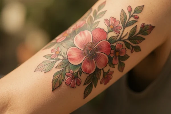
Placed on the upper arm, the painterly bloom feels casual and wearable. I once got a small arm watercolor that looked like it had been painted from a distance – exactly the vibe here. Ask your artist for soft outlines so the colors stay the focal point.
Side-Leg Pink Pop
That bright pink on the side of the leg reads young and joyful without being cartoonish. You can keep it minimal or surround it with tiny splashes of complementary color. Placement like this is flattering for movement and dresses really well.
Shoulder-to-Chest Watercolor
Flowing from shoulder to chest is dramatic. I once saw someone with a similar layout and it looked like real paint had been brushed onto skin – gorgeous. If you want an organic, asymmetric feel, ask for subtle bleeding where petals meet skin.
Paint-Splatter Bloom
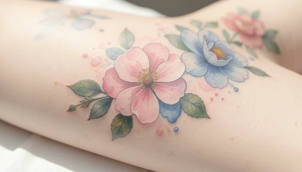
This artistic flower with paint splatters screams modern watercolor flower tattoo designs to me. It’s playful, a little messy, and purposely imperfect – which is the whole point. Try that splatter look if you want your tattoo to feel dynamic instead of static.
Butterfly Floral Mix
Butterflies paired with flowers add motion and storytelling to a piece. I remember choosing a tiny butterfly for mine because it softened the floral composition; this combo can balance bold color pools. You can keep outlines faint so the butterfly melts into the watercolor instead of standing apart.
Pink Arm Accent
On the outer arm, a single pink bloom feels confident without shouting. Try pairing it with a very light gray stem to suggest shape without heavy lines. If you wear a lot of sleeveless tops, this placement will get compliments.
Arm and Leg Pairing
Matching or complementary pieces on arm and leg create a sense of balance across the body. I once debated doing both sides and ended up loving the symmetry, even though they were different scales. Keep the color palette consistent between the two for a harmonious look.
Mini Floral Collection
Small flowers arranged down the leg feel like a secret garden. These are perfect if you can’t commit to a large piece but want repeated watercolor texture. Pick a focal bloom and let the others be soft echoes.
Long Arm Washes
Wrap-like watercolor on the forearm reads delicate and intentional. I had a sleeve idea once that used long washes just like this to connect smaller motifs. Use negative space to let the color breathe and avoid overcrowding.
Palette Study Prints
Four different color studies are great if you’re still deciding on tones. This is exactly how I finalized my own palette by comparing swatches side by side. Ask your artist to mock up a few colorways so you can try them against your skin tone.
Leg Flower Accent
A single flower on the leg can be quiet but meaningful. Place it where clothing will reveal it occasionally – that surprise is so fun. Consider subtle shadowing under petals for depth without heavy lining.
Wrist Keyed Bloom
The wrist with a tiny watercolor and a key detail feels like a secret keepsake. I gifted myself something similar after a big life change and still smile when I see it. If you want symbolism, small motifs like keys can layer meaning into a floral piece.
Dragonfly Meadow
Dragonflies and flowers together read ethereal and breezy. I love the way the insect adds a narrative – like a paused moment in a garden. Ask for soft translucency on wings so they feel light against the blooms.
Shoulder Petal Cascade
A cascade across the shoulder is flattering with sleeveless tops and swimwear. I remember staring at this style for ages because it looks effortless yet curated. Your artist can shift color intensity so the highest contrast sits where you want the eye to land.
Delicate Arm Flower
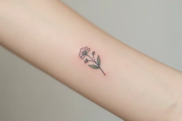
Simple arm blooms are classic for a reason – they age well and look soft through time. Sometimes less really is more, especially with watercolor where color saturation changes during healing. Make sure your aftercare is solid so soft edges don’t blur too much.
Shoulder Splash Color
Bright, colorful shoulder pieces feel like a statement without being overbearing. A pop of saturated color at the shoulder can balance a neutral wardrobe beautifully. If you want to stand out, this placement is a happy medium.
Painterly Paper Study
Works-on-paper give your artist a direct reference for wash and blending. I once brought a painted print to my appointment and the artist matched tones perfectly. Use these references to communicate how much color bleed you want.
Blue-Purple Centerpiece
Cool-toned flowers in the center of a piece feel calm and moody in a good way. I always reach for blues when I want something a little quieter but still colorful. Tell your artist if you prefer cool or warm undertones so the final piece doesn’t clash with your skin’s natural tones.
Chest and Arm Harmony
Connecting chest and arm with florals reads cohesive and intentional. A friend of mine covered old linework this way and the watercolor really softened the look. Discuss how the pieces will align when you move so nothing feels chopped in motion.
Purple-Accented Sleeve
Subtle purple blooms in a sleeve create depth without competing with bright hues. If you’re nervous about full color, starting with accents like these can ease you into bigger palettes. Make sure your artist uses layering so the purple reads luminous not flat.
Pink Arm Charm
Soft pink on the arm always feels feminine but not cliche. I had a similar pale-pink portait and it attracted gentle compliments rather than loud reactions. Keep outlines airy to preserve that faded, watercolor look.
Colorful Butterfly Garden
Combining multiple butterflies and flowers creates a lively narrative across the arm. Sometimes I wish I’d added more tiny details like these to my first piece – live and learn, right? If you like movement, this style reads beautifully in motion.
Loose Paper Florals
Watercolor studies on paper are perfect for translating into tattoos that feel airy and experimental. Bring prints to your session if you want exact brushwork translated. Your artist can adapt brush strokes into saturation and line work for permanence.
Stomach Pink Petals
Side-stomach flowers look delicate and private, great for pieces you show selectively. I remember trying on a transfer in the mirror and being surprised at how flattering it felt. If tenderness is your goal, keep color soft and outlines minimal.
Black-and-White Floral Art
A monochrome floral piece with artistic hearts feels nostalgic and modern at once. You can combine grayscale shading with subtle watercolor hints for a hybrid effect. Consider this if you want the appearance of watercolor without saturated colors.
Classic Shoulder Tattoo
Shoulder tattoos age well and are easy to keep healed. I almost got mine there before picking forearm, so test placements with stick-ons to see what feels most natural. Placement matters for how you and others see the piece day-to-day.
Thigh Pink Accent
That tiny pink on the back of the thigh reads flirty and thoughtful. If you want something intimate and playful, a spot like this is perfect. Healing is usually smoother here since clothing can offer some protection.
Three-Petal Side Bloom
Three coordinated flowers on the thigh are clean and story-driven – anniversary flowers, seasons, memories, whatever you want. I once matched three tiny blooms to represent important people in my life and it felt really personal. Think about scale and spacing so each bloom can breathe.
How to Actually Make This Work For You
Start by collecting 2-3 clear references that show the exact color saturation and edge softness you love, and bring them to a consultation so your artist isn’t guessing; ask about pigments they use for watercolor effects because some colors fade faster and may need touch-ups. Consider placement with movement in mind – areas that stretch often will change how watercolor edges settle, so plan for slightly bolder saturation if you want longevity. Finally, be open to your tattooist’s input on line weight and blending – they know how specific colors react on skin and can tweak the concept so your watercolor flower tattoo designs translate from photo to living canvas.
Frequently Asked Questions
They can fade sooner than traditional styles because lighter pigments are used, but proper aftercare and sun protection stretch their lifespan. Expect touch-ups down the road if you want that vibrant wash maintained.
Choose areas that don’t constantly stretch or rub, like the shoulder, upper thigh, or back. If you pick a high-movement spot, be prepared for softer edges over time and possibly more maintenance.
Pain is mostly about location and your personal threshold rather than the watercolor technique itself. Expect typical tattoo sensations depending on where you place it.
Keep it clean, moisturized, and out of the sun while it heals; once healed, use SPF to protect those delicate pigments. Your artist will give exact product and timeline suggestions, so follow their plan.
Thanks for scrolling through these picks – I hope you found a few watercolor flower tattoo designs that make your heart skip. Save your favorites, pin them to a board, or text a friend who needs inspo because sharing always helps me decide. If you end up booking something, please tell me – I love hearing about new ink.